What to wear
Getting dressed for family photos doesn’t have to feel like a group project gone sideways. The right colours, a bit of intention, and a few firm “nos” go a long way. Here’s everything broken down so you can stop second-guessing and start getting excited.
Alberta gives us four genuinely distinct seasons — which means four genuinely different opportunities to look incredible in front of a camera. Here’s how to work with each one, not against it.
Spring
Spring in the Bow Valley is soft, fresh, and a little unpredictable — green things coming back, mountain snow still hanging on, that particular quality of light that’s clear and gentle.
Palette ideas
- Soft and romantic: blush, dusty rose, warm white, soft sage, lavender grey
- Fresh and grounded: sage, cream, warm tan, soft olive, pale denim
- Neutral bloom: oatmeal, camel, terracotta, muted coral
What works here: Light layers (a linen jacket, a light knit cardigan), soft florals on one piece, breathable fabrics that move well. Spring light is forgiving, you can pull off softer, more delicate colours without them washing out.
Avoid: Heavy wools, very dark palettes, anything that reads “winter”, the contrast with the fresh green landscape will feel off.
Summer
Golden hour in the foothills in July is something else. The light is warm, long, and dramatic. You want colours that can hold their own against a big sky and open fields, without competing with them.
Palette ideas:
- Warm and sun-drenched: rust, camel, warm white, dusty gold, terracotta
- Cool and fresh: powder blue, soft white, sage, pale denim, warm grey
- Rich and earthy: olive, burnt sienna, cream, warm burgundy, deep teal
What works here: Linen, chambray, light denim, flowy fabrics that photograph beautifully in a breeze. One bolder colour piece (a rust dress, a deep teal button-up) anchored with neutrals.
Avoid: Bright white in full sun — it blows out and can create harsh contrast. Neon and heavily saturated colours compete with the landscape rather than sitting inside it.
Fall
Fall is the big one. The Bow Valley in October is basically a photography cheat code, golden light, amber aspen groves, rich colours everywhere. Your job is to complement that, not compete with it.
Palette ideas:
- Classic fall warmth: rust, burnt orange, camel, cream, warm brown, forest green
- Rich and moody: deep burgundy, olive, warm tan, mustard, cognac
- Soft and elevated: dusty rose, warm grey, cream, sage, soft burgundy
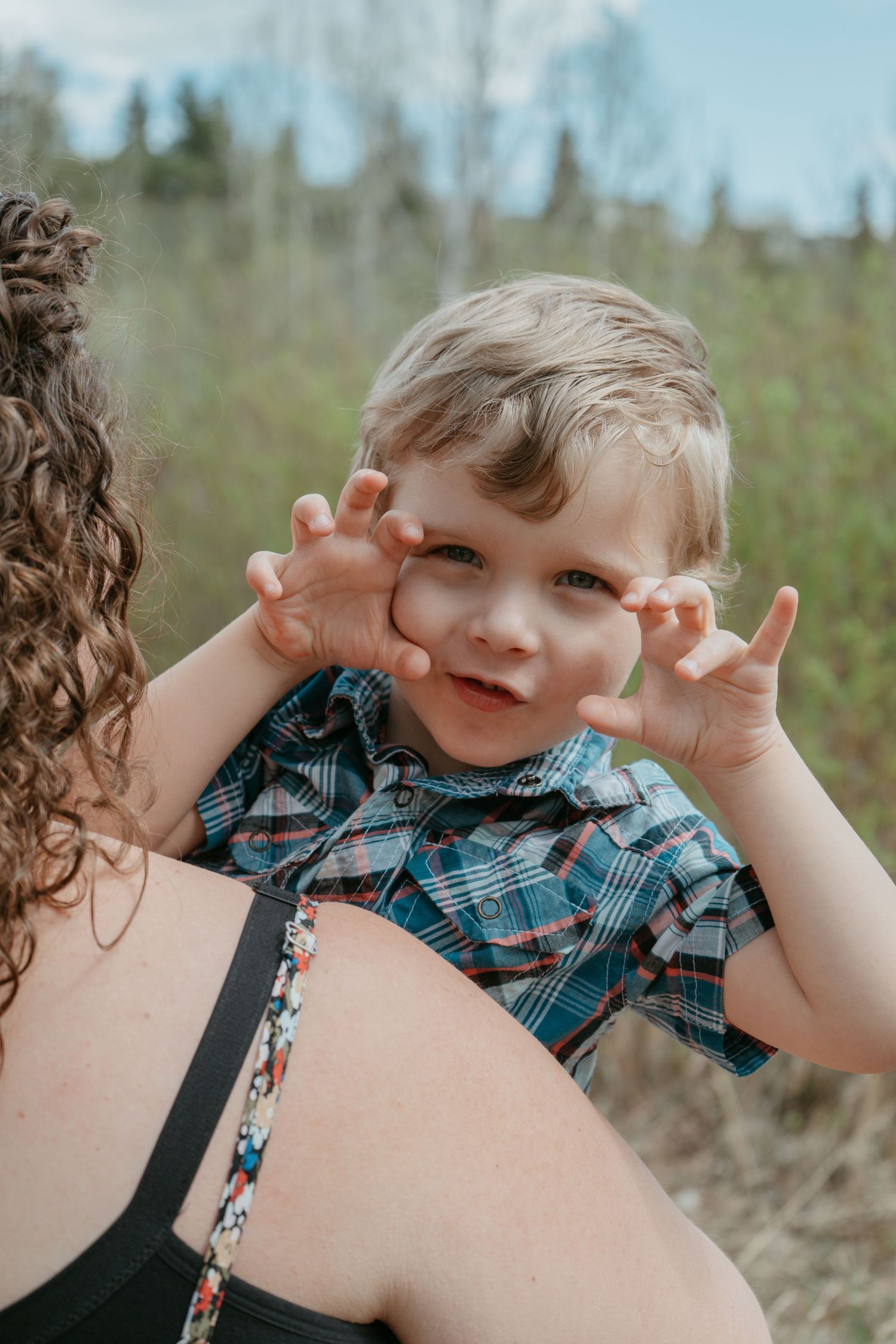
What works here: Layers, layers, layers. A denim jacket. A chunky knit. A plaid or flannel as a shirt or blanket scarf. Leather boots. Fall is the season where you can lean fully into texture and warmth and it looks intentional rather than overdone.
Avoid: Cool-toned colours (icy blue, cool grey, stark white) they fight the warmth of the light and the foliage. Also avoid anything too fashion-forward that will look dated in five years, because fall photos tend to be the ones that end up framed forever.
Winter
Winter sessions in Alberta are underrated. Snow-covered foothills, bare aspens, that flat blue-white light, it produces photographs that feel cinematic and still. The trick is dressing warm enough to actually enjoy it while looking like you planned the whole thing.
Palette ideas:
- Classic winter: deep navy, cream, charcoal, camel, soft burgundy
- Warm against the white: rust, camel, warm brown, forest green, off-white
- Cozy and rich: mustard, plum, deep olive, warm grey, cream
What works here: Heavyweight knits, wool coats, scarves and hats (yes, include them, they add texture and personality). Boots. Layers you’d actually wear outside. The styling element here is warmth, and that translates beautifully.
Avoid: Looking cold. If you’re shivering, it shows in your face, your posture, your kids’ mood. Dress for the weather first, then style within that. Also avoid all-white winter looks, they disappear into the snow
Pick a palette, not a colour
Choose two or three colours that work together and let each person pull from the palette in their own way. Dad doesn't need to wear exactly the same rust as the accent in Mom's dress, he can wear a complementary warm tan. Your teenager can wear something slightly different as long as the undertone connects.
A workable palette example for fall:
-Rust (Mom's dress)
-Cream (Dad's henley, baby's romper)
-Forest green (older kid's cardigan)
-Camel (Dad's boots, younger kid's pants)
Nobody matches. Everyone belongs together.
Dress for comfort and camera
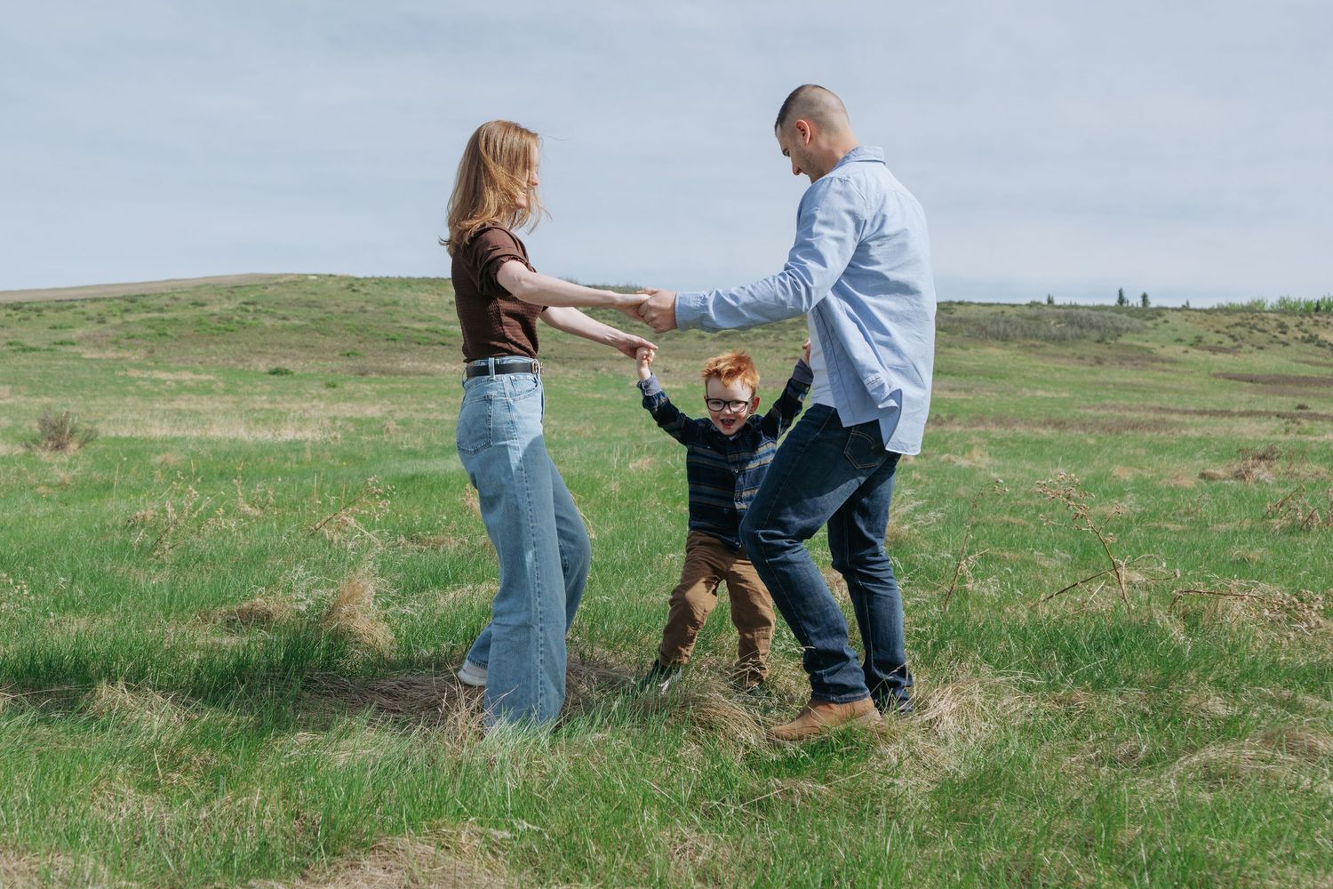
A family that's physically comfortable moves differently — more freely, more naturally, more like themselves. This matters because I'm not posing you like mannequins. I'm following your family around and catching what happens when you're just being you. You need to be able to run, crouch, lift your kids, sit on the ground, and laugh without worrying about your outfit. Ask yourself: Can I move in this? Can my kids move in this? If yes — you're good.
What to avoid
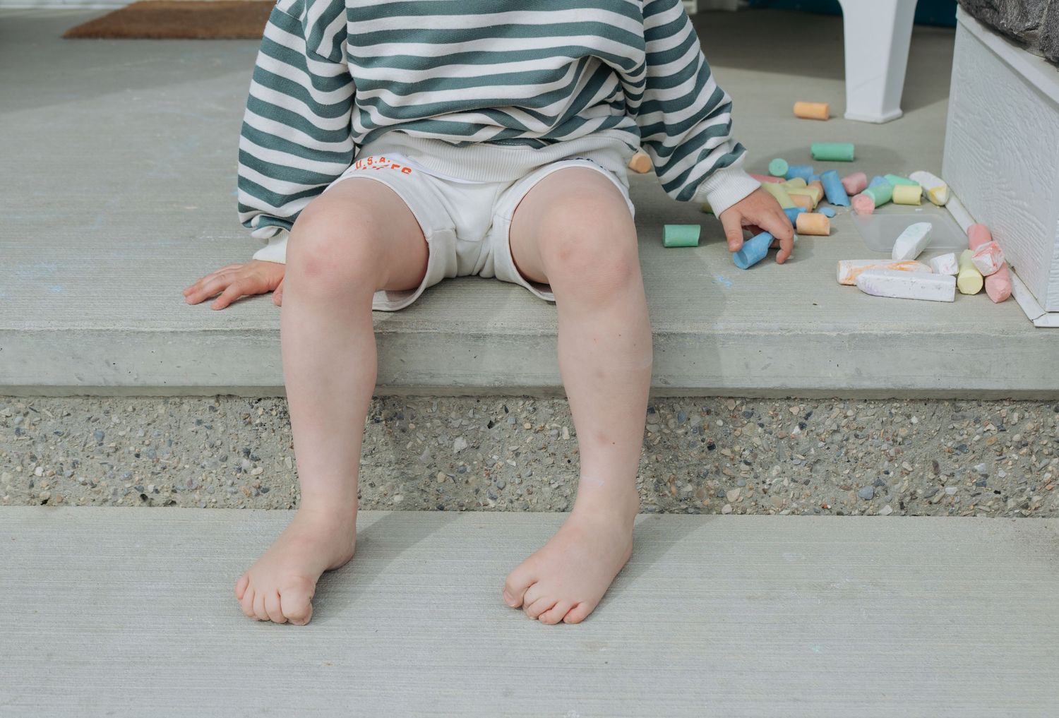
Graphic tees and large logos
They pull the eye away from faces, and they date photos faster than almost anything else. A family photo from 2025 with a tour tee from 2024 is going to feel old before it should.
Matching outfits
Unless you're going for a very specific aesthetic (coordinated Christmas photos, for example), identical outfits tend to look stiff rather than connected. Coordination always beats matching.
Heavily wrinkled or visibly unwashed clothes
It sounds obvious, but I mention it because it's easy to overlook in the chaos of getting a family ready. Do a quick once-over the night before.
You don't need a stylist. You don't need a Pinterest board with 200 pins. You just need to feel like it represents you and your family. When in doubt, go warmer, go earthier, go more textured. In Alberta light, that formula almost never fails.